Tag Archives: infographic

Infographic of the World’s 10 Biggest Food Companies

30 Jan

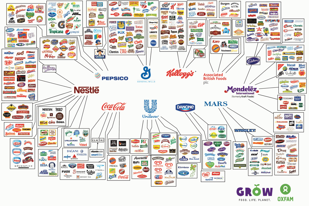
We love sharing infographics with our readers, especially foodservice ones. In the spirit of education, did you know that so many of our favorite food and beverage brands are owned by just a handful of companies? Just as with data, we find it fascinating how a visualization can bring a concept to life! What else did you learn about looking at the infographic below?

Big companies like Kellogg, Coca-Cola, and PepsiCo rarely sell their products directly to the consumer. Instead, they use foodservice distributors that will sell and ship their product s for them. These distributors are the middleman between the manufacturer and the foodservice operator, and help brands get their products inside restaurants, schools, and hospitals.

If you are a business looking for distributors to carry your products, CHD Expert can help you get in touch with key decision makers in the foodservice industry. Our databases are updated monthly and can provide you with useful information to help select the right distributor for your company. If you have any questions or want to learn more about CHD Expert’s Foodservice Distribution List, please give us a call at (312) 768-6900 or email Cathy at cathy@chd-expert.com.

Click here to view a sample of our Foodservice Distributor List!

We Sell Data, We Manage Data.

7 Oct

Author: Nico Watson

Here at CHD Expert, our main focus is data. We sell data, we manage data, and we create insights around data! Data is at the core of our business. Especially foodservice data. That’s what we specialize in. We know the foodservice market place better than any other “generic” data provider out there.

We can help you improve your sales and marketing efforts. Want more info or to talk to one of our foodservice experts? Email me, Nicolas Watson (nwatson@chd-expert.com) to discuss how we can help your business.

In the mean time, this week we saw an awesome infographic that is all about data and we wanted to share it. Check out this amazing infographic about how Data Never Sleeps! Pretty amazing right? Thanks Domo for putting this visual all about data together!

infographic

America’s Favorite Food And The Economics Behind The Hamburger

22 Jul

Author: Nico Watson

Memorial Day Weekend usually kicks off the first official BBQ of the summer, and something we know is that Americans love hamburgers and cheeseburgers! Funny enough, while everyone seems to love hamburgers, everyone loves to dress their hamburger in their own way!

One of our favorite examples of individualized hamburgers is the menu and secret menu at In-N-Out. Did you know you could order a 3×3, ketchup and mustard instead, whole grill and pickles? It’s true! In-N-Out lets you customize a burger just the way you like it, even if it’s not on their menu, or their not-so-secret-menu.

As you know, here at CHD Expert, we provide data to foodservice professionals. Do you know which state has the most burger restaurants in America? According to our 2012 Foodservice Operator Update, California has the largest percentage of hamburger restaurants in the US, coming in at 12.3%. Furthermore, there are a total of 50, 064 hamburger restaurants in all of the US. Want more restaurant data, fill out the form to request a call. Click here.

When we saw this great infogaphic about hamburgers that uses data to tell us about the economics behind America’s favorite food, the hamburger, we got very excited! Take a look and let us know what you think? We are still amazed by staggering ketchup statistic that 71 pounds are consumed per person each year! Yikes

So next time you fire up the grill, take a good look at how you’re assembling your burger and how you contribute to the economics of Americans favorite food.

The Impact of Fast Food on America – InfoGraphic of the new (AB)Normal

29 May

Fast food portion sizes have increased since 1950s and companies like McDonalds do not want to admit that they might be part of the problem. Last week, McDonald’s Corp. voted down a proposal to assess its impact on public health, particularly childhood obesity. Do you think that fast food has contributed to the problem?

The Center for Disease Control came out with a new infographic that is jaw dropping – but not in a good way. The May 23rd Daily News article titled, “Fast food burgers have tripled in size since the 1950s: CDC graphic,” reports the latest in a recent onslaught of news highlighting out-of-control portion sizes and weight problems in America.

According to the recent CDC study, in the 1950s typical fast-food burger weighed just 3.9 ounces. Now, it’s 12 ounces, which is three times larger today then it was 50 years ago. Another great stat that the CDC discovered is that an average order of fries has grown from 2.4 ounces to 6.7 ounces. Shocking right? But, the biggest shocker of the study is centered around sodas. The study reported that today, people drink 42-ounce sodas, which is up from the comparatively skimpy 7-ounce soda pours people got at fast-food restaurants in the ’50s. Now, that data has quite an impact!

Check out the new infograpich below. And be sure to check back for more foodservice industry news updates.

CDC The New (Ab)normal

Foodservice Data: Infographic on Summer Grilling Trends

12 Apr

CHD Expert is a foodservice database company, so just incase you didn’t know, we love foodservice data and foodservice trends.

This week we stumbled upon a great inforgraphic of data points for this summer’s grilling season. The title of the infographic is called, “Data points: Grilling Season Begins With a Spotlight on Beef.” Take a look at the different findings from the data. (Just click on the image to make it bigger.)

Source: SupermarketNews.com

Do you agree with the survey or do you have different habits. If you do, share them with us. We’d love to hear what our readers have to say. Share your comments below.

Thank you to SuperMarketNews.com and ConAgra Foods for conducting this survey and putting together this infographic and article. To read the full article, click here.